Complete Logo Reimagination Case Study
Grant County State Bank
Project goals
Grant County State Bank was looking for a fresh, modern look, and a recognizable identity that could scale with their business. We planned to build them a new brand that made them feel like, even as a small financial institution, they could sit at the table with their larger competitors.
A New Brand Mark
Grant County State Bank needed an updated logo – one that felt modern and fresh, with better digital scalability and clarity, and with a mark that could stand on its own.
A Reimagined Color Palette
Grant County State Bank lacked a clear brand color palette, so we set out to create one that felt distinctive and that would support ADA conformance.
A New Visual Language
Grant County State Bank wanted to highlight their stately, trustworthy values. We planned to highlight these with a unique design system that would be consistent across all different media types.
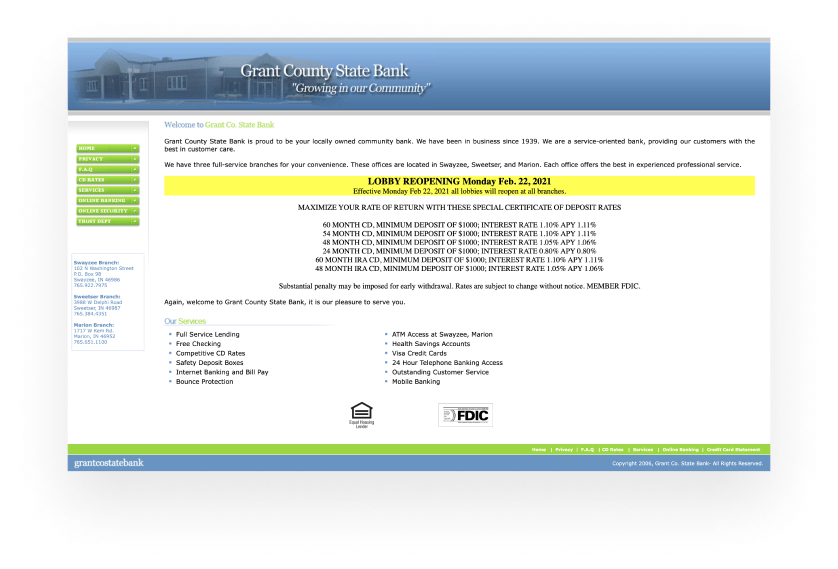
Original Branding
Grant County State Bank’s original branding really needed attention. They lacked a logo mark, design system, and unique visual identity. Their digital presence as a whole felt dated, and the team wanted a fresh look that was modern and scalable.
Logo mark
Since their original branding lacked a distinct logo mark, we started Grant County State Bank’s new logo with a blank slate. We needed a simple shape that could be used in different colors and medias, that could scale as they expanded outside of Grant county, and that felt classy, elegant, and timeless. We decided to focus on the ‘G’ and ‘C’ of ‘Grant County’, creating a type-inspired symbol and a word mark to match.

Brand language
The next step was to build a visual language that would make Grant County State Bank easily recognizable. They wanted to present themselves as the sophisticated, proud, trustworthy institution they are, and continue to grow the strong reputation they had developed in their community.
Using their new simplistic mark with a metallic treatment was the keystone to expressing themselves successfully.
color palette
To complement their new branding approach, we put together a reimagined color palette for Grant County State Bank that felt elegant and timeless, using a range of neutral, sophisticated tones and metallic gradients. To ensure it would work well for all their customers in all necessary contexts we chose colors that support ADA conformance.

typography system
We chose Raleway Semibold as the primary font for Grant County State Bank’s new logo – its dignified, sans-serif design felt like a strong match for their new simplistic mark. To round out their new typography system and bring a sense of sophistication to the brand we chose Libre Baskerville Bold as a supporting font.

Brand Application
Finally, we brought all the new branding elements together and put them to the test with a range of brand application examples. These included print materials and merchandise.

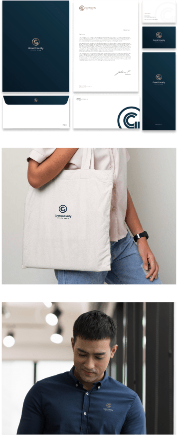
Note: These are theoretical brand applications. our team does not implement physical design application, but encourages you to work with your local marketing or print agencies, supplying everything they'll need.
See the brand in actionBetter Together
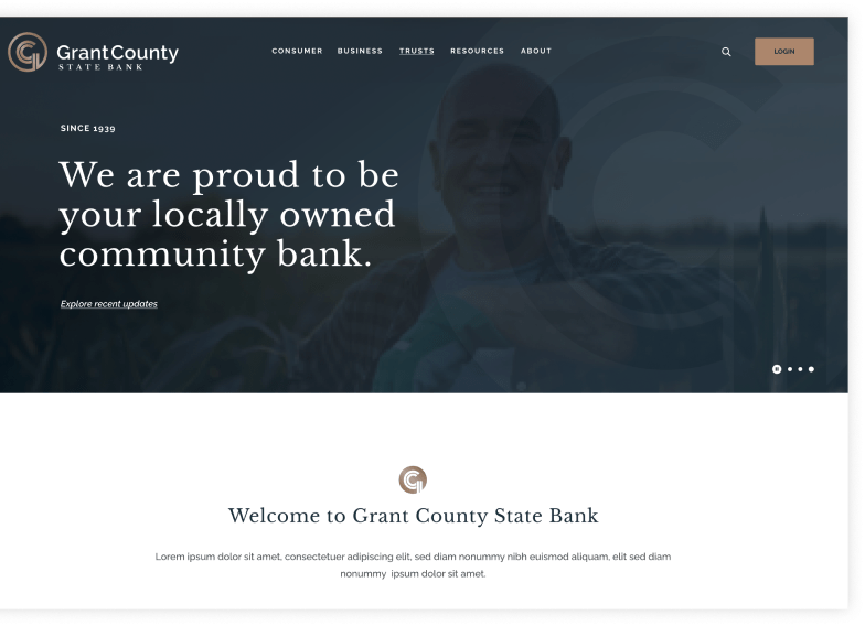
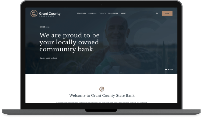
a fresh website for your new brand
In addition to this branding project, we worked with Grant County State Bank to build a beautiful Showcase+ website – the perfect way to share their new identity.
Complete Logo Reimagination
want to know more about our process?
Check out a full breakdown of how we approach Complete Logo Reimagination projects.