Visual Elevation Case Study
First Community Bank
Project goals
First Community Bank wanted a consistent and memorable brand, with a visual language that would resonate with their customers and serve their marketing team for years to come.
Logo Modernization
Though we wanted to keep First Community Bank’s logo intact, the original design needed a little help to prepare it for digital use. We aimed to make small adjustments like fixing distorted elements, evening out spacing, and adjusting letter tracking to enhance scalability.
Color Palette Adjustment
We were looking to tone down First Community Bank’s current color palette by introducing more jewel-tones, while still keeping their current brand direction overall, and ensuring everything adhered to ADA standards.
Brand Element Refresh
First Community Bank felt that their primary brand element – an angle – was limiting them creatively. We planned to replace this element with something that would provide them with more flexibility.
Imagery Updates
First Community Bank has a rich, blue–collar heritage that they are very proud of. We wanted to highlight this by updating their approach to imagery use, including photos of beautiful scenery and a focus of their culture.
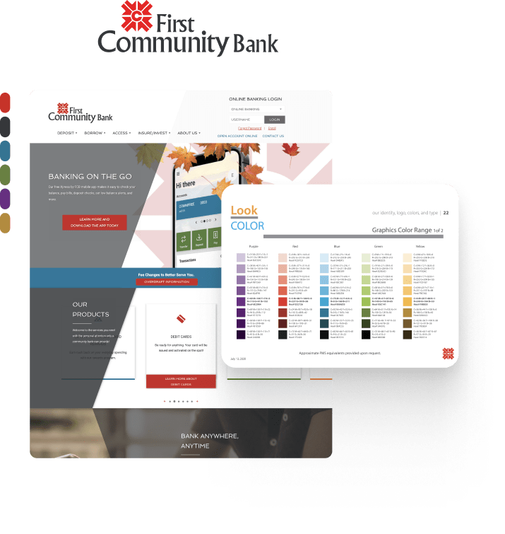
Original Branding
First Community Bank’s original branding didn’t quite portray their institution in the way they wanted. With our project plan in place, we set out to make updates that would highlight their unique values and heritage.
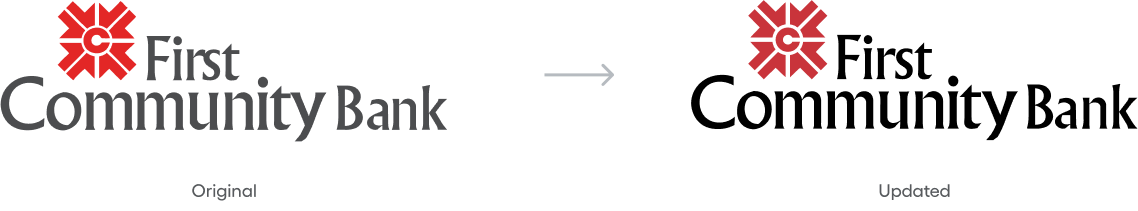
Logo mark
First Community Bank’s logo hadn’t been touched in a while, and we needed to improve and adjust the small pieces that were causing scalability and clarity issues.
Brand language
With First Community Bank’s many different departments of focus, we needed to help the brand system stay organized. The intentional use of brand colors helps users quickly identify pieces of First Community Bank across mediums.
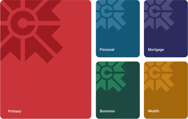
color palette
To update First Community Bank’s brand colors without changing the overall direction, we adjusted the palette to lean more towards jewel-tones. This made them feel timeless and classic, playing further into their classic heritage.

typography system
Since the type treatment in First Community Bank’s original logo was still working well – aside from some minor tweaks to spacing and color for scalability and clarity – we decided to keep the original typeface, Albertus MT, the same.
To help modernize the brand and bring consistency across materials we implemented Roboto as a supporting font.

Brand Application
Finally, we brought all the new branding elements together and put them to the test with a range of brand application examples. These included signage, merchandise, print materials, and social media designs.
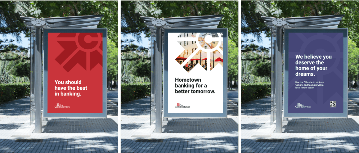
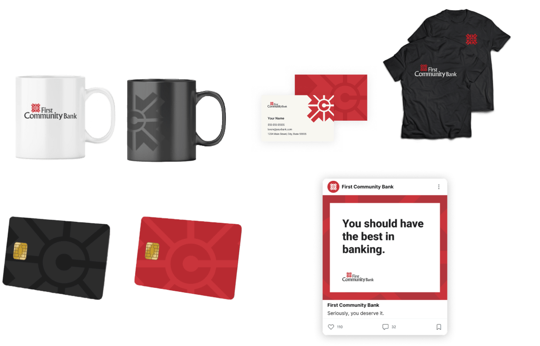
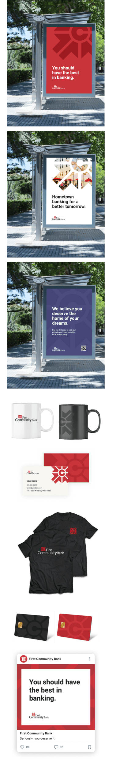
Note: These are theoretical brand applications. Our team does not implement physical design application,
but encourages you to work with your local marketing or print agencies, supplying everything they'll need.
Visual Elevation
want to know more about our process?
Check out a full breakdown of how we approach Visual Elevation projects.