April 2026
Tap2Local for Retail CUs • Guest Chat Available • New Treasury Management Features • Plus More
Read our latest round of news, notes, and project updates in the April 2026 edition of the Digital Statement.
May 2026
If your calendar looks anything like ours, you’ve spent May in many meetings, ruminating on solutions and strategies. Fortunately, we've landed on some smart decisions and powered through with our engineering team for another productive month, including rolling out a fresh batch of digital banking upgrades for your teams.
Go ahead and give this Statement a close read to see what we've shipped and what's in the works!
As we teased last month, we've been working on a new Monthly Statement experience for you. Final testing and launch prep is underway now, and we're currently on track to make the cutover the week of June 15.
The redesigned Statement landing page will live at the same URL (banno.com/statements) and will improve upon the current design in meaningful ways. In short, the new experience features a modern design that makes it easier to browse and digest all our product news and announcements – on your desktop or on the go!
Here are the key dates remaining in our steady march toward unveiling the new design:
Be sure to join us for the demo during the June Digital Banking Meetup, so you can see what to expect the following week, when we flip the switch on a brighter Product Statement experience!
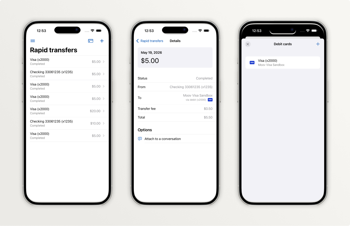
As you know, we've been working to ensure that our mobile apps remain as intuitive, scannable, and seamless as possible while we incrementally adopt standards from Apple's Liquid Glass design system and Google’s Material Design 3. Take a look below to see what changes your accountholders will see in Banno Mobile 3.35.
In the 3.35 release, we focused on updating our Jack Henry Rapid Transfers screens, which signal the overall aesthetic that will be deployed across the entire app in terms of landing pages and detail screens. Here is a summary of those changes, some of which you can also see reflected in the three screenshots above:
Important: See more details about these changes in our iOS App UX Evolution Knowledge Base article.
Future versions of iOS will continue to iterate on the foundational pieces we have incorporated earlier this year. We anticipate enabling Liquid Glass in a release later this fall, and we will provide an overview of the visual changes you should expect in a future Statement.
More work needs to be done in preparation for the next screen redesign. We want to make sure we have our foundations in place before we expand the list of screens to be redesigned.
The next screen we plan to redesign is the Alert settings screen found within account details.
Be sure to reference our Android App UX Evolution Knowledge Base doc for info on additional plans.
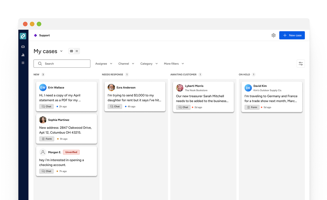
Jack Henry is redesigning the Banno Support product from the ground up to create a faster, more unified experience for modern support teams. The reimagined Support experience will notably improve how your support staff manages customer conversations by providing quicker access to customer context and smarter tools for case handling in a streamlined workspace built for daily support operations.
As we're currently doing with the UX Evolution for Banno Mobile, we plan to deliver Banno Support changes in a series of releases over the coming months. To help you prepare, we've added a new page to the Service & Support section of the Knowledge Base that provides an early look at where Banno Support is headed. See what lies ahead. →
As of May 28, your authorized security administrators can now perform 2FA resets on behalf of other Banno Admin and Identity App users (including Treasury Management back office users).
Your security admins with the newest Users & Groups permissions (View security settings and Delete security settings) can now reset enrollments on behalf of another employee by navigating to the individual's profile, clicking the Security tab, and removing their established 2FA settings.
As we're able to integrate more Jack Henry products with Jack Henry Identity, we aim to continue enhancing our service for increased efficiency and ease of use anywhere we can. A couple goals for this ongoing work are to minimize any related need to submit support tickets and to drop the wait time involved when your staff needs changes to their security settings.
Going forward, resetting enrollments for their fellow employees will be the responsibility of your security admins, and the task will only require a support ticket or Jack Henry's involvement in the rare scenario that all your security admins are locked out of the system.
Last month, we completed our rollout of Device Removal Reasons. Your users (and your staff) are now prompted to provide a reason when deauthorizing devices. We're already seeing thousands of reasons flowing through the system, providing us with crucial labeled data we can use to identify suspicious patterns of activity in the future.
Within Banno People and in the Identity app, your designated staff will soon be able to mark history events as suspicious or fraudulent as well as add notes to help with any ongoing investigations or to provide context when reviewing past events.
Once released, you just need to grant access to the right staff members by assigning three new permissions – View labels, Manage suspicious labels, and Manage fraudulent labels.
The option to label history events is currently expected to roll out to all financial institutions by the end of June – no support ticket needed.
Important: New features released for Identity App are also relevant to customers with Treasury Management, so this update benefits Banno and Treasury customers alike!
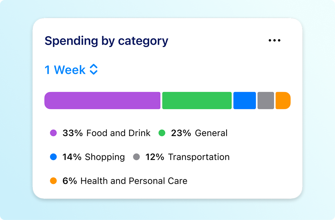
We are thrilled to announce that the mobile version of our enhanced Spending by Category feature (previously referred to as the Spending Wheel) is launching very soon! This update brings the powerful functionality of the Banno Online version directly to your accountholders' mobile devices.
Leveraging our advanced transaction enrichment feature, Spending by Category on Banno Mobile will give your accountholders a fast, highly accurate, and seamless breakdown of their expenses on the go. In short, the feature will empower them to make smarter decisions and improve their financial health wherever life takes them!
If your financial institution has Spending by Category enabled for Banno Online, the mobile version will automatically become available to your accountholders upon release.
Note: Our transaction enrichment service is required to enable Spending by Category. If you have not yet enabled transaction enrichment for Banno, you can get started, simply by opening a support ticket when you're ready.
Please join us at our upcoming events:
Please join our upcoming Office Hours with key SMEs from Jack Henry and Moov. The current cadence (alternating the focus every other week between Tap2Local and Rapid Transfers) will continue each Wednesay through at least June and July. Register now:
Join key product, strategy, and engineering leaders for insights on the direction of all tokenized money (including stablecoins) and to see demos of the software we’re building to help you bridge across crypto and fiat monetary systems.
Register now for any or all of our upcoming office hours:
To receive SLA emails for all things that matter to you, head to our Subscription Manager and subscribe accordingly. Please also spread the word with your colleagues, so your whole team gets the respective SLAs that matter to each of you!
The Developer Relations team has updated our video gallery with a brand-new recap video of the CU Build 2025 event.
We hope this quick trip down memory lane sparks some creative inspiration for your team and gets your credit union pumped to join us this year as CU Build is making its grand return to Nashville from July 24–26, 2026. We'd love to see you there!
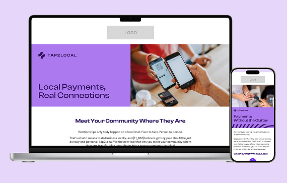
Winning the local market starts with making sure your small business owners know you offer the tools they need to succeed. You can now boost Tap2Local adoption and drive engagement by using the pre-built campaign assets in the Jack Henry Marketing Center. This complimentary campaign provides an expanded set of assets – including emails, landing page, banners, brochures, and postcards – to help you empower your community today.
Ready to drive growth? Visit the Marketing Center to access free marketing materials to reach established SMB accounts or uncover consumer accountholders with potential “side gigs” who need a professional way to pay.
Supporting small-to-medium sized businesses (SMBs) has become a key growth driver for many banks and credit unions, but funding SMB growth can challenge traditional lending models and the risk appetites of even the most community-focused financial institutions.
Enter the Jack Henry LendingNetwork, a strategic service that helps your SMB clients access alternative lending sources when the business is not a fit for your institution's credit underwriting standards.
Join us for a strategic discussion with time for open Q&A, and learn how you can help support SMBs in your market more effectively on Wednesday, June 24 at 1:00 p.m. CT. Register now to save your seat!
Beginning with Tax Year 2026 filings (submitted in calendar year 2027), the IRS will retire its legacy Filing Information Returns Electronically (FIRE) system and replace it with the Information Returns Intake System (IRIS). This change affects all financial institutions that file information returns such as forms 1099, 1098, 1042‑S, and 5498.
These changes are part of the IRS’s broader effort to improve data accuracy, security, and processing efficiency for information returns.
Jack Henry is actively preparing for the IRIS transition and offers flexible options depending on how your financial institution files today. To help you understand what’s required and what steps to take next, we’ve assembled a helpful list of frequently asked questions.
To help keep you informed, we’ve created a resource site on the For Clients portal that you can bookmark for convenience. We’ll be planning a webinar in the month of June to provide you with an opportunity to hear from our experts and get help with your planning. Watch for the upcoming announcement and make plans to join us!
We're happy to report big progress on a few important features for Jack Henry Wires.
We completed development on our integrations with both CIF 20/20 and Core Director and each will be entering closed beta testing soon. These integrations are the last puzzle pieces for Jack Henry Wires to support all four Jack Henry foundational cores – a huge milestone that we can’t wait to celebrate! We’ve still got some testing to do before we can officially pop the champagne, but we will continue to keep you updated on our progress in future Statements, so stay tuned!
We're developing our integrations with Banno Business for SilverLake and Treasury Management, which means that wires created in Banno Business or Treasury Management will automatically appear in Jack Henry Wires for processing. Once development is complete, we will move on to closed beta testing before releasing more broadly.
Note: This functionality already exists for Banno Business credit unions.
If you’ve got customers or members who need the ability to schedule a recurring wire, we have good news for you. We're building out support for scheduled/recurring wires, which will let your customers or members schedule a recurring wire through your digital banking experience or let your staff schedule a recurring wire on their behalf. You won't want to miss this time-saving feature, so we’ll keep you in the loop regarding progress in future Statements.
While exceptions for Jack Henry Rapid Transfers are not common, there are, ahem, exceptions to the norm. With that in mind, we're pleased to announce that the Jack Henry Exception Manager will soon be made available to SilverLake banks to help streamline the process of working Rapid Transfer exceptions.
This will equip your team with clear decisioning options; your authorized admins can easily manually post the exception – right there in Banno Admin – or retry it so that the system picks up right where the Rapid Transfer left off.
Furthermore, the Exception Manager uses detailed transaction types to clearly explain which part of the transfer failed – such as distinguishing between an entire failed transfer or just a failed fee. This empowers your staff to efficiently resolve the issue without additional, unnecessary postings to your General Ledgers.
No additional contract or support ticket will be required for this feature, and we will provide additional details here in the Digital Statement as we get closer to launch. Finally, please note that we also have plans to make this new functionality available on all other foundational cores in the future (we don't have a timeframe to share yet).
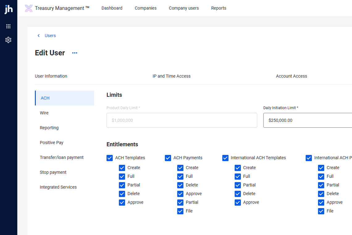
The new Back Office for Treasury Management has officially entered its next chapter: Beta testing is now underway with five banks. This milestone marks a major step toward delivering a more powerful, intuitive, and future‑ready platform for every Treasury institution.
Early feedback from our Beta partners is already helping shape refinements to workflows and operational controls. We’re excited to bring this evolution to all Treasury banks later this summer!
This enhancement lets businesses transmit Issued Item files directly to Treasury Management using sFTP – minimizing manual uploads and reducing the risk of human error. Key capabilities include automated file loading, a new Issued Items File Activity page for viewing and processing files, PDF downloads, notifications, and full use of existing Positive Pay entitlements and mapping tools.
Contact your Account Executive to contract for this service or ensure your existing Data Transmission contract covers Check Issue Items in addition to sFTP for Wires and ACH.
Our SilverLake bank customers with both Banno Business and Enterprise Workflow (EWF) will be glad to see this one: We’re wrapping up closed beta on a new enhancement that allows banks utilizing EWF to automatically generate the NTID and initial business administrator right from a customized workflow.
This update completely eliminates the need to dive into core NETPAR menus, cutting out the typical processing delays so the business and user appear in Banno People immediately. Once the workflow runs, your team can instantly finalize permissions in People and send the user invite – streamlining your business onboarding from start to finish.
Keep an eye on future Monthly Statements for the official release announcement and full documentation details. Not yet contracted for Banno Business or EWF? Reach out to your Digital Experience Sales Executive to get started.
Coming soon to Banno – greater clarity, accuracy, and transparency for your rate swap loans. We are rolling out a new enhancement, empowering your accountholders to view their contractual fixed interest rate and accurate total payment amount directly within their account details screen.
Currently, the digital banking platform only displays the underlying variable rate, which can create confusion regarding your exact contractual obligations. For SilverLake customers, this update completely closes that gap by securely integrating your comprehensive swap loan records into Banno Online and Mobile banking views. Once released, your accountholders will always have a precise, real-time look at their true loan terms.
Here are a few notable Knowledge Base pages (and collateral) we added or edited during May:
Note: Due to browser behavior beyond our control, PDF links may open directly in this same browser tab.
If you have questions about anything you have read here, please contact Support.
Release notes are posted in the For Clients Portal in advance of mobile releases and contain a rollup of all client-side changes made to Banno within the period.
Want to stay in the know about the latest features and enhancements we’re making to the Jack Henry Digital Banking Platform? Subscribe below and you’ll receive an email straight to your inbox every month when the Digital Banking Statement hits the press!
SubscribeLet's talk about what this could look like for your financial institution.